
I promised an explanation in English of the post I wrote about my Performance Management Chart for the year 2011.
Where does the data come from? Every swim, bike ride, and run I do, I’m wearing my Garmin Fenix 2 watch. This marvel of the computer age records a broad stream of information about what I’m doing: how long; how far; how hard. The time is straightforward: a watch is a watch, so when I press the “Start” button, train, then press the “Stop”, it remembers the length of time I was actually training. And it also associates with each time increment (usually a second), lots of other data. First, there is a Global Positioning System (satellites) which knows where I am at any given moment. As that position changes over time, the watch can figure out how fast I am going. Also, my heart rate is being recorded by a chest strap. If I’m in the pool, the internal motion sensors of the watch can tell how many lengths I’ve swam, even what stroke I am using. On the bike, the watch receives a wireless signal from my rear hub, telling it how hard I am pushing on the pedals. While running, in addition to how fast I am going (determined via GPS) it can also detect how fast I am moving my feet (steps per minute), and how high I am bouncing, as well as how long each foot is in contact with the ground.
How is this data turned into a measure of “performance”? It’s one thing to collect the data; it’s another to use it to understand how hard I am working while training. That’s what the Performance Management Chart (PMC) is designed to help me understand. About 15 years ago when power meters for bikes first appeared, exercise physiologists started to figure out how to translate that raw data (appearing as “kilojoules”, a measure of energy), into something cyclists could use in real time and real life. “Watt” became the standard unit, a measure of power. One watt equals one joule per second. Some smart guy wrote a few equations which looked at the output of watts over time, and produced a measure of the work done while cycling. He called this the “Training Stress”. I won’t discuss those formulae here – it is calculus, after all – but note that the Training Stress Score (TSS) is used as a quick and dirty measure of the work done in any given workout. Similar thinking lies behind “rTSS”, for running, and “sTSS” for swimming, both based on a combination of time and effort, similar to power, but in this case, represented by speed, or pace.
How do we use the performance measures? So individual workouts can be theoretically compared to each other in terms of how much stress they apply to the body. The body reacts to this stress in one of three ways: it says, “ho, hum, that was easy, if I keep this up, I’ll get weaker”; or, “I can handle that, it’s pretty standard stuff, at least we’re not getting weaker now”; or, “Wow, that was hard, I’d better have some time to rest and recover from that! But In the meantime, I’m getting stronger” Now, those three subjective feelings will vary, depending on how “fit” I have become through repeated training. A TSS of, say, 50 might be hard when I first start out training, but after three months, it might be very easy, and thus not helpful in improving my fitness. That’s where the Acute Training Load (ATL) and the Chronic Training Load (CTL) come in.
Acute Training Load (ATL): This number looks at the past week, assigning gradually decreasing value to workouts done further back in time. In simplest terms, it’s designed so that a daily dose of, say, 100 TSS will appear as 100 ATL. It’s meant to indicate
“How hard have I been working over the short term?” If this number is going up, it means workouts over the past week have been getting progressively harder.
Chronic Training Load (CTL): The same concept as ATL, but over a 42 day period. Again, a means of seeing how much training stress has been applied over the past 6 weeks. Both ATL and CTL are expressed as “TSS/day”
Training Stress Balance (TSB): Simply, the CTL minus the ATL. So, a negative number means that I’ve been working harder and harder, on average, as time goes by. This is a good place to be while getting ready for a big event. It means fitness is improving. If the TSB is positive, that means either I’m slacking off, or I have been purposely letting myself recover from harder workouts by doing “easier” ones, either for short term recovery, of as final preparation for a race.
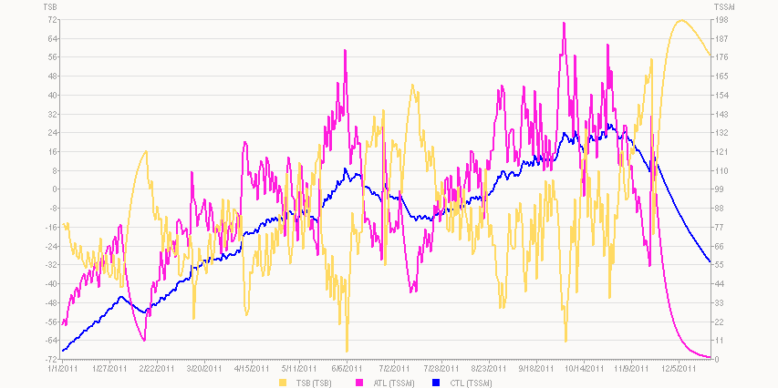
So, what’s a Performance Management Chart? A PMC looks at these three elements – CTL, ATL, and TSB – over time. On this PMC, X Axis is time: basically, 2011. Y axis shows both Training Stress Balance (Left scale, yellow) and Training Stress Scores per day (Right Axis, for CTL [blue] and ATL [purple]). NB: this chart does not include swims; I could go back and add each as a manual entry, but who has the time or patience for that? Maybe later, to demonstrate the value (or lack thereof).
When creating a PMC, its important to not only set the date range, but also the starting values for CTL and ATL, as well as the number of days back the algorithm looks for TSS in each of those. In my case, I use the default 42 days for CTL and 7 days for ATL, and have the luxury of starting each from zero, as I was laid up following a bike accident from Sept 17 >> Dec 15 2010, doing absolutely NO training. So this chart represents someone coming entirely “off the couch” into a training year.
(To be continued)